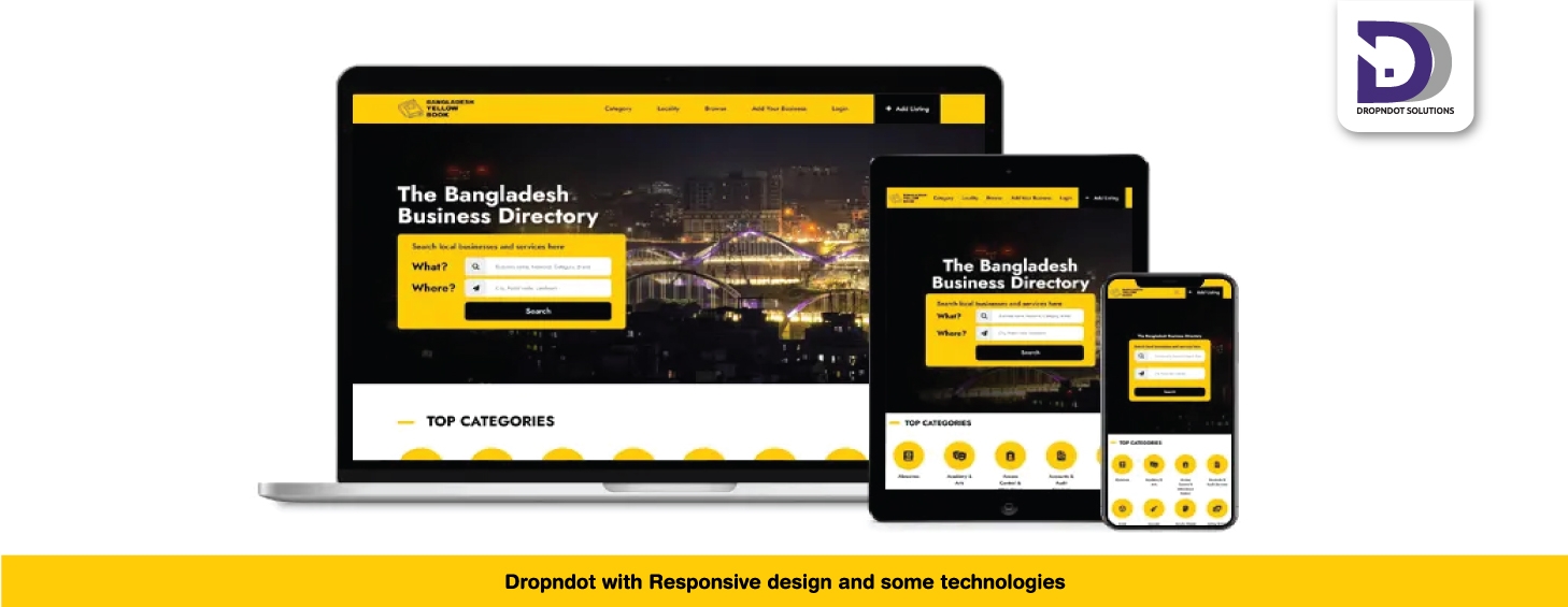
Dropndot with Responsive design and some technologies
- design,
- service
2011 was very important for dropndot limited. In this year we have achieved many success as well lose some. It was the 2nd year with DD. We have learned some technology such as how to do responsive design, shopify and start working with html5, css3 etc. We are still learning the technique of html5 in different purpose.
Now most of our clients want mobile version of a website. To providing mobile version of a website, responsive design helps us lots. Using this technique we can build a website for laptop, tablet or iphone with a single css and html file. During the design we have to keep in mind it should be a responsive design.
Another technique, we are working, is microformat and I loved the words “Designed for humans first and machines second”. A microformat is a web-based approach to semantic markup which seeks to re-use existing HTML/XHTML tags to convey metadata and other attributes in web pages and other contexts that support (X)HTML, such as RSS. This approach allows software to process information intended for end-users automatically.
share on
recent post
let’s build website together
call now +8801716855340get in touch! to know what we do for you.
We Are Solution-Driven And Like To Talk About Challenges. We Are Keen Listeners Too. Talk To Us And Get In Touch With The Experts In The Respective Field.

Telephone: +8801716855340
Email: info@dropndot.com