Senior Site
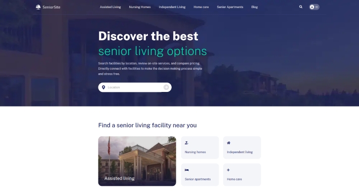
This website is an old age home website that provides information about a residential care option for older adults or people with disabilities who need assistance with daily living activities but do not require the intensive medical care provided in a nursing home.
Assisted living facilities are designed to provide a homelike environment with access to personalized care, 24-hour supervision, and various support services. The website of an assisted living facility typically includes information on the types of services provided, the level of care available, amenities offered, and the location of the facility. It may also provide details on the qualifications and experience of the staff, admission requirements, and the cost of living in the facility.
Project Details
This project is completely user friendly. This project has been created with a unique concept and design. The project is built using HTML, CSS, Bootstrap, and jquery on the front end. Also, the Laravel framework of PHP is used for the back end and WordPress for the blog Page. Otherways, it is entirely 100% SEO supported.
Technology
- Concept and Design |
- php |
- laravel |
- Wordpress |
website strategy
We follow several key steps to ensure a successful website strategy when the site comes to us for processing:
- Choose the right platform: Choose the right platform that suits our website’s needs, such as Laravel, WordPress, Joomla, or Drupal. These platforms provide a variety of features and templates that can be customized to create a professional-looking website.
- Develop a responsive design: Ensure our website is mobile-friendly and responsive, as more and more people are accessing websites from their mobile devices. Use responsive design techniques such as flexible grids and images to create a website that adapts to different screen sizes.
- Optimize for search engines: Incorporate search engine optimization (SEO) best practices into our website coding, such as using relevant keywords in our meta tags, optimizing your page titles and descriptions, and optimizing your images for search engines.
- Ensure fast load times: Optimize our website coding for fast load times, as slow-loading pages can negatively impact user experience and search engine rankings. Use techniques such as caching, minification, and gzip compression to reduce load times.
- Use clean and organized code: Use clean and organized code that is easy to read and understand, as this can make it easier to maintain and update our website in the future. Use best practices such as commenting our code and following coding standards to ensure your code is easy to read and understand.
- Implement lead capture tools: Incorporate lead capture tools such as contact forms, calls-to-action, and landing pages into our website coding to capture visitor information and build your email list.
- Integrate social media: Integrate social media sharing buttons and feeds into our website coding to encourage social sharing and engagement.
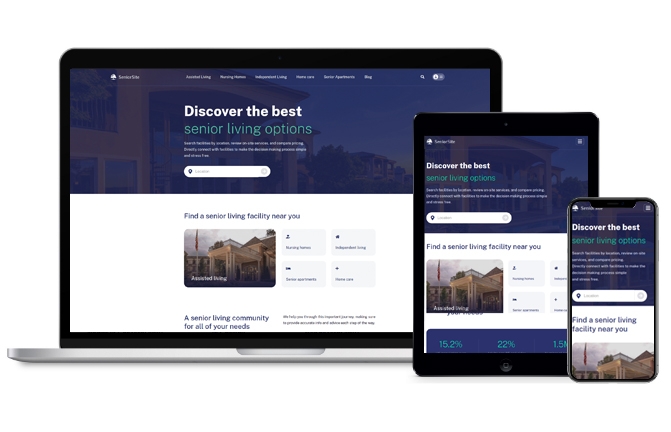
Mobile Responsive Design
Mobile responsive design is an approach to web design that ensures a website displays correctly and works seamlessly across different devices, including desktop computers, tablets, and smartphones. With mobile devices accounting for more than half of all internet traffic, having a mobile responsive design is critical for a successful website strategy.
Here are some key elements of mobile responsive design what we follow:
- Flexible layout: A responsive design uses a flexible layout that adapts to different screen sizes and resolutions. This means that the website layout will adjust automatically based on the screen size of the device being used to view it.
- Fluid images: Images on a responsive website are also flexible, scaling up or down depending on the screen size. This ensures that images are not distorted or cut off on smaller screens.
- Readable fonts: Responsive design uses fonts that are easy to read on different screen sizes. This means using fonts that are large enough to read on smaller screens without having to zoom in.
- Navigation: Navigation on a responsive website is typically simplified to make it easier to use on mobile devices. This may involve using a drop-down menu or a hamburger icon that expands to show navigation links.
- Touch-friendly buttons: Mobile responsive design uses buttons that are easy to tap with a finger. This means buttons are large enough and spaced out enough to avoid accidental clicks.
- Page load speed: A responsive website is optimized for fast page load times on mobile devices. This involves minimizing file sizes, reducing server requests, and using caching techniques to speed up page loading.
let’s build website together
call now +8801716855340get in touch! to know what we do for you.
We Are Solution-Driven And Like To Talk About Challenges. We Are Keen Listeners Too. Talk To Us And Get In Touch With The Experts In The Respective Field.

Telephone: +8801716855340
Email: info@dropndot.com